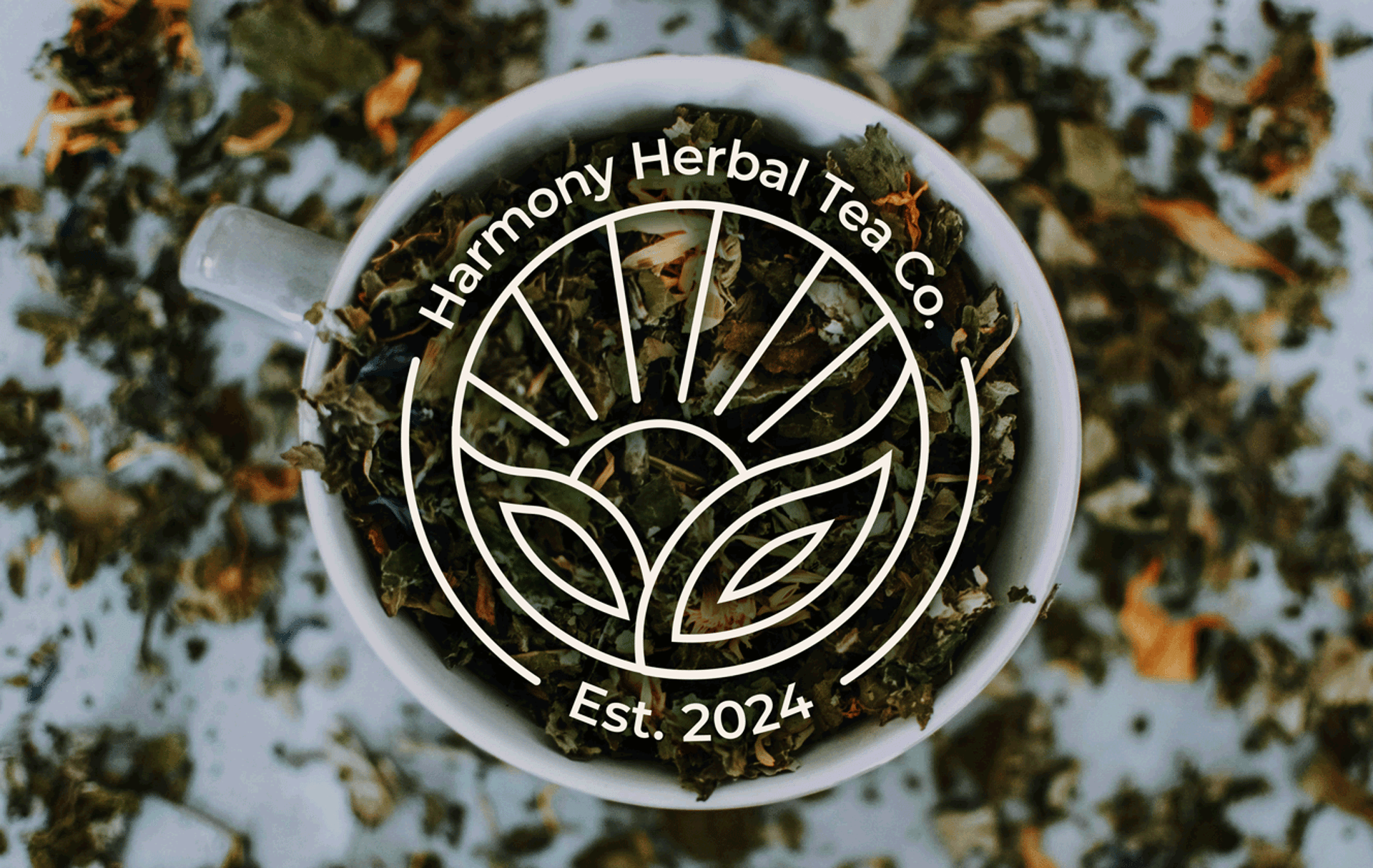
Harmony Herbal Tea Co. creates a sanctuary in every cup, blending calming elegance with the nurturing essence of nature. With a focus on mindfulness and sustainable living, the brand offers herbal teas that evoke peace and balance, supporting the modern individual in their journey toward holistic wellness. The serene, organic feel of Harmony reflects its values: nurturing the body and mind through sustainably sourced ingredients, while fostering a deeper connection to nature.
Harmony Herbal Tea Co.
scope
Brand Identity
Package Design
Challenge
Approach
As a practice brand, Harmony Herbal Tea Co. was developed to explore how a wellness-focused tea company could meaningfully stand out in a crowded marketplace. In an oversaturated category dominated by brands like Tazo, Pukka, and Yogi Tea, the challenge was to create a unique design and identity that reflected Harmony’s core values—calm, nurture, and sustainability—while resonating with modern wellness consumers. The goal was to build a brand presence that felt elevated, authentic, and emotionally aligned with those seeking more than just another tea on the shelf.
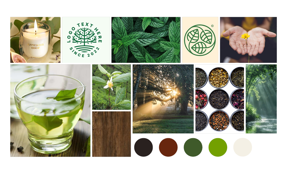
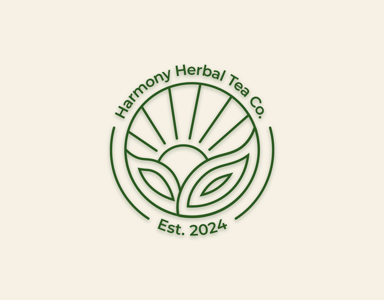
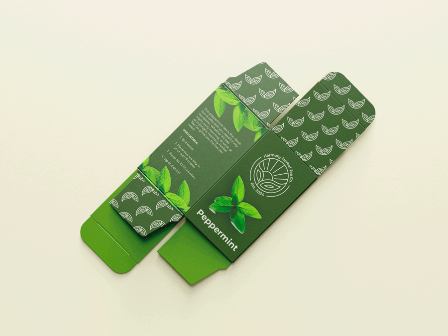
To create a brand identity that truly reflected Harmony Herbal Tea Co.’s calming and nurturing values, we began by grounding the design direction in its core inspiration: mindful living, natural remedies, and sustainable simplicity. This foundation guided every creative decision—from the choice of earthy color palettes and botanical illustrations to elegant typography that evokes a sense of ease and wellness. We developed a comprehensive visual system, including logo refinements, packaging mockups, and social media templates, all designed to communicate a premium yet approachable presence. The result is a cohesive identity that positions Harmony not only as a trusted tea brand, but as a daily wellness ritual for the modern, mindful consumer.




Ready to align your brand with your mission? Book a free brand analysis.
© 2025. All rights reserved.


